

Contact Sheet: Dixon Street
One photo, five ways

When I get home from a little walk taking photos of strangers, the first thing I do is take the memory card out of the camera and import the photos. I have to do it this way because if I don’t, I’m guaranteed to carelessly format the card and lose all the images (sorry about your birthday snaps, Natt).
When I got the day’s photos of the camera yesterday afternoon, I found an interesting series of images. They’re not the best photos I’ve ever taken (or even the best photos I took yesterday), but I think they illustrate my photo making process, and maybe the way street photographers work in general. If you’re interested, I’m going to walk you through them now.
So, I’m on Dixon Street around midday yesterday when I see a guy having a quiet moment on a bench under the newly renovated Chinatown Gates. Immediately, I recognise him as an interesting subject. He’s in a world of his own and from where I stand his wiry hair is backlit. His posture suggests a negative state of mind. Sadness? Resignation? Plain old tiredness?
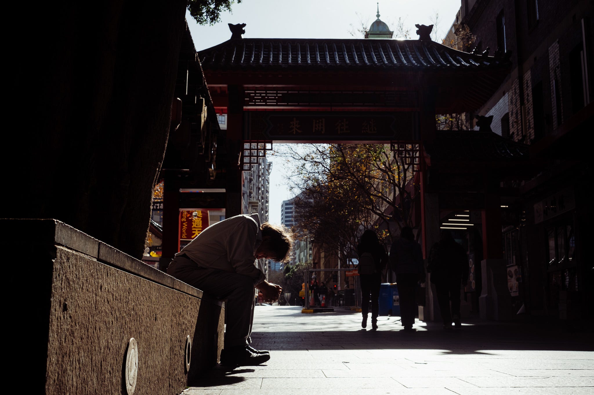
This is the first shot I take. I get low and shoot up because I want to get the whole of the gate in the frame.
It kind of works, but I’m annoyed by the silhouettes of the passers by on the middle right of the frame, which overlap with the gate and the tree and generally make things messy. I also feel like maybe there’s too much negative space on either side.
So I move a little closer. In the meantime, the silhouettes have walked out of the shadow. But they’re still overlapping with all sorts of shit. I’ve also lost the top of the gate.
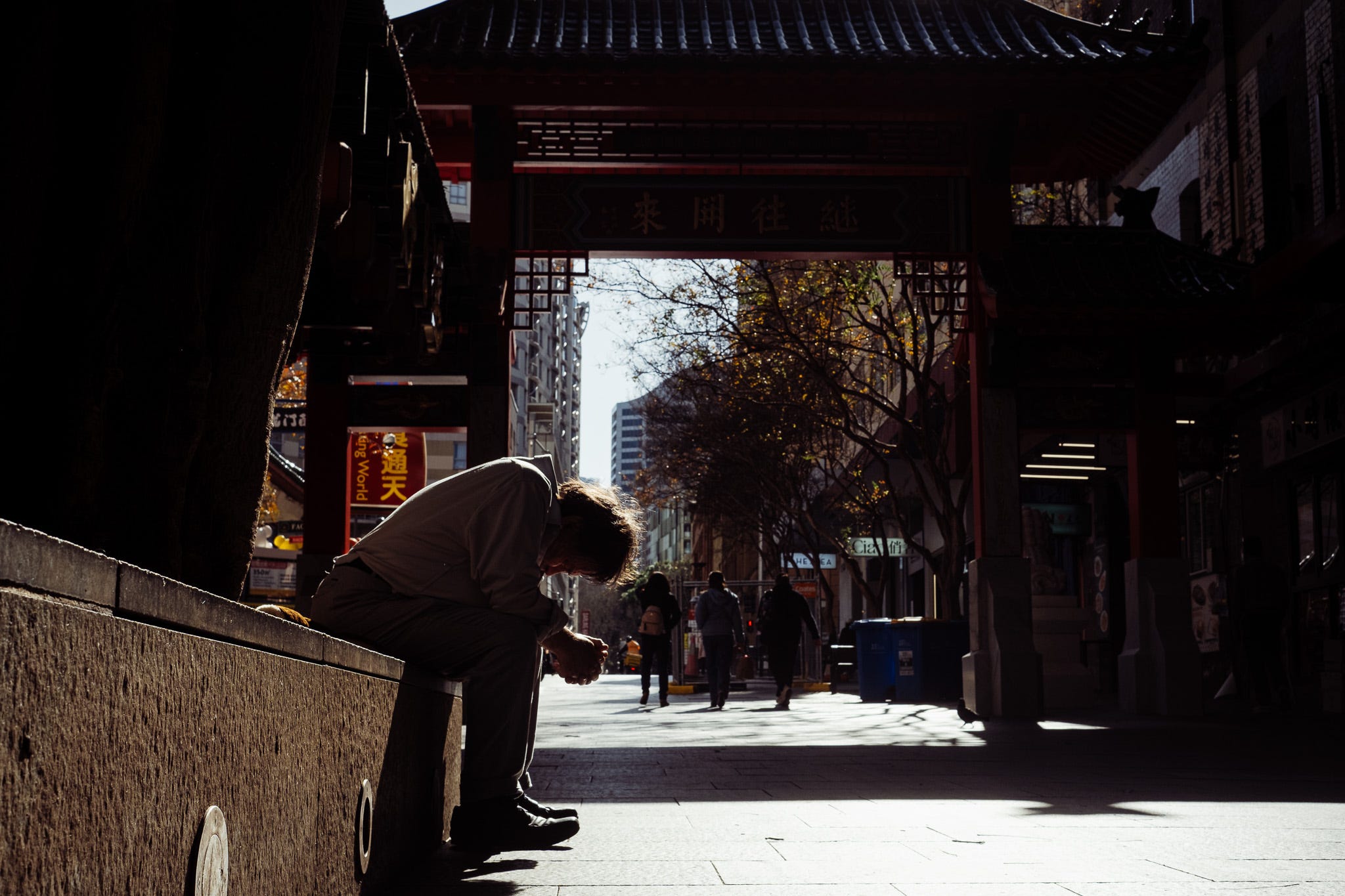
It might be one of the most overused quotes in photography, but I tend to think Robert Capa was right when he said, “If your photos aren’t good enough, you aren’t close enough.” So my the next thing I do is - you guessed it - get even closer.
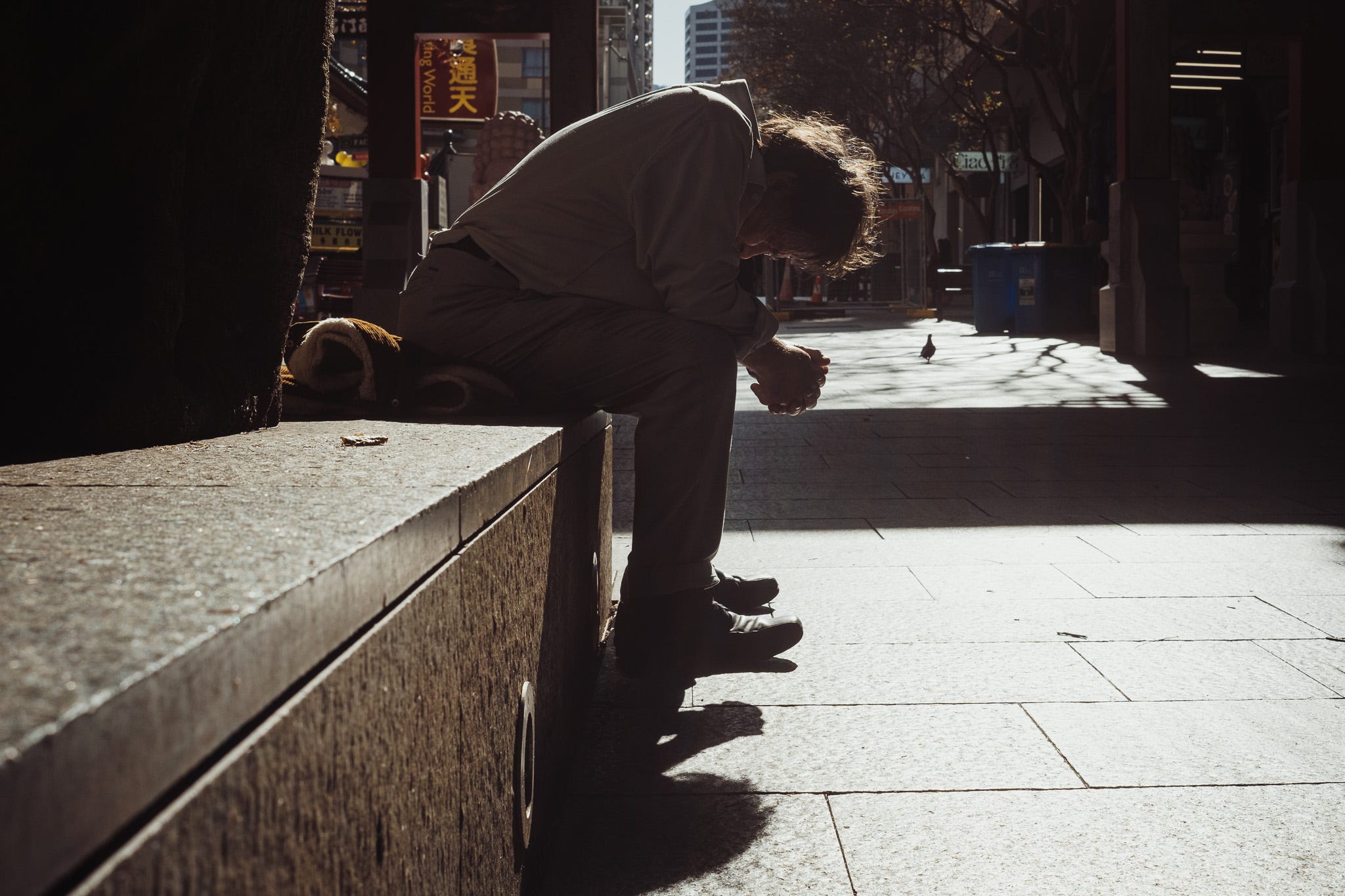
I don’t get right up in his grill because at this stage I’m thinking that the leading line of the bench and his shadow are still key elements of the shot. But I’ve taken myself out of the shadow and there’s sunlight going directly into the lens, so I lose some of the contrast which made the scene appealing. I’ve also lost a lot of the context.
The obvious next course of action would have been to get even closer, or to step around him and shoot up close from the opposite angle with a shadowed section of Dixon Street behind. For some reason this doesn’t cross my mind, maybe because I’m hyperfixated on the new gates.
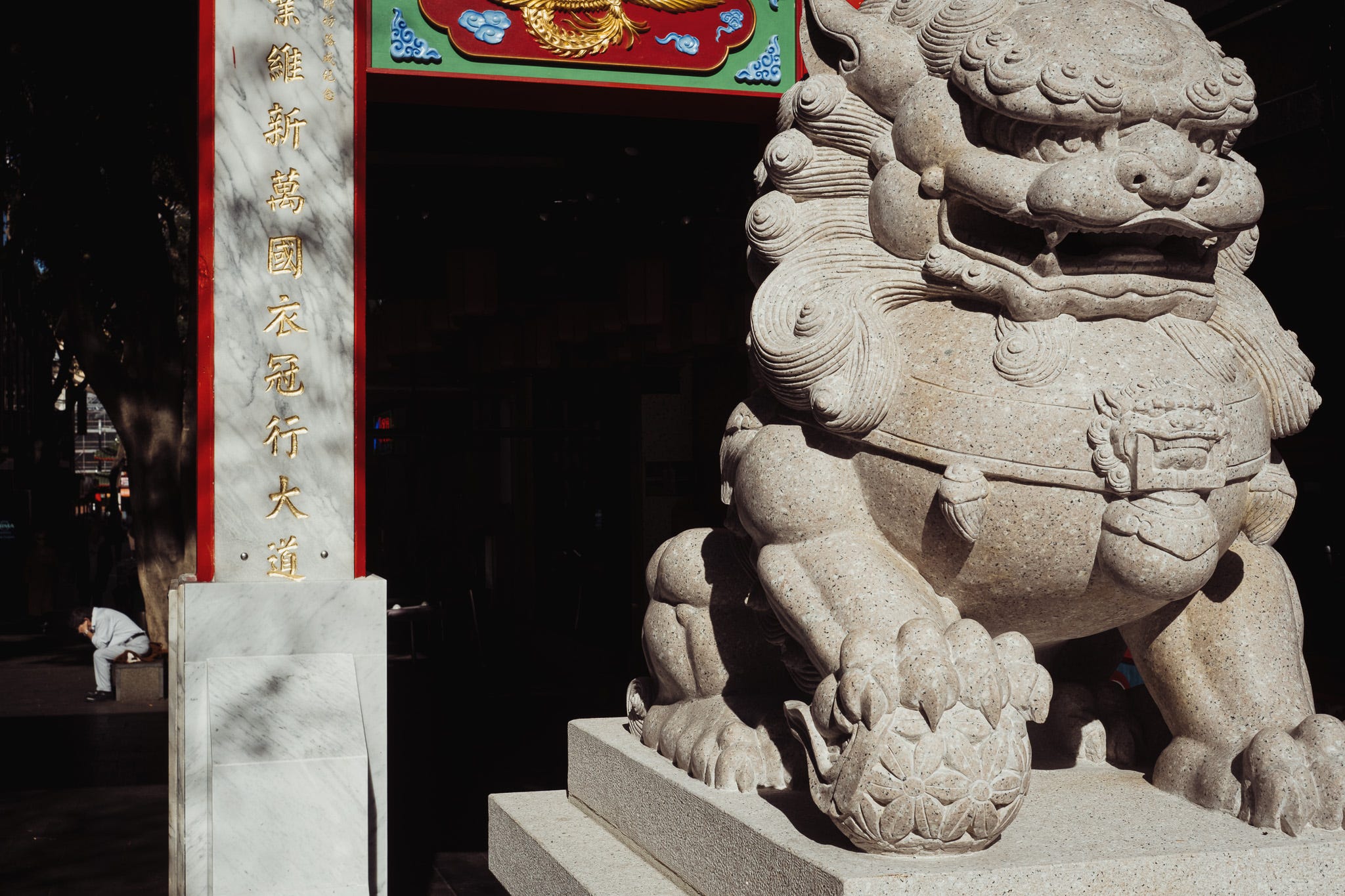
Instead, I go a bit further down the street and try shooting him with the gate and a guardian lion in the foreground. I quite like this; the red of the newly repainted gates absolutely pops and there’s a lot of depth to the composition. But our man, who was once the main subject, is now on the edge of the frame in the background, so maybe his expressive posture gets a bit lost.
I’ll spare you the 13 other version of this I take, all trying to get the lion, the gate and the man into a pleasing arrangement. They’re all pretty much the same.
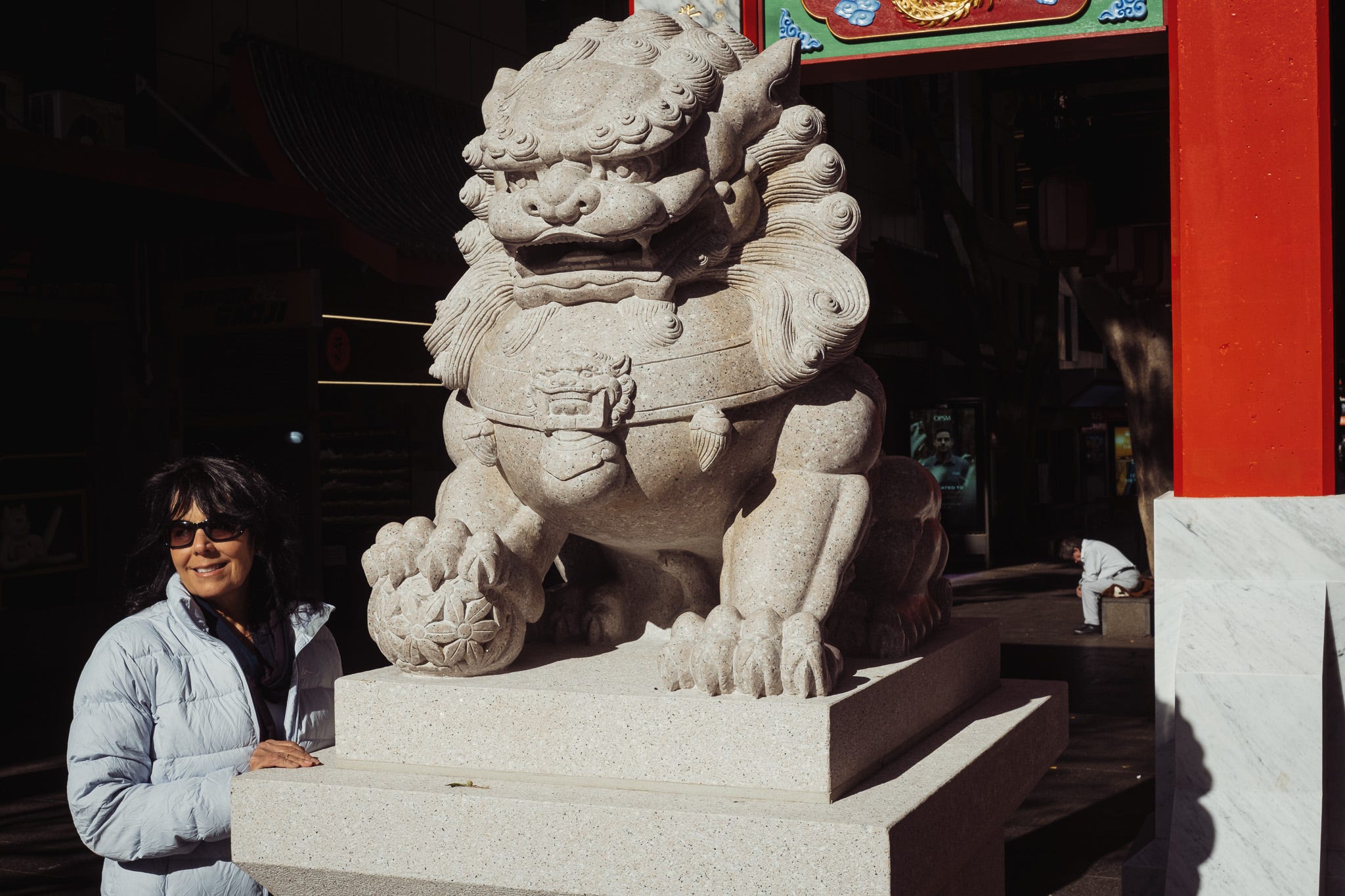
At some point my concentration lapses and I notice a pair of middle-aged women are standing behind me, waiting for me to finish my activities (which they clearly regard as quite eccentric - can’t blame them). They want a happy snap with the lion.
I take a step back and gesture for them to go for it. As the first one smiles for the camera, I realise that her carefree #chinatownsydney pose might make an interesting juxtaposition with the man’s dejected body language. So I take bring up my camera and piggyback off their snapshot.
The idea was a good one, I think, but my original subject is so far from my lens he just looks like a guy on a bench.
In total, I press the shutter button 19 times as I try to capture this scene, and don’t end up with a photo I’m really happy with. But it’s interesting (at least for me) to look back on the process and think about what I missed and what I could have done differently to get the shot.
As it stands, I don’t even know which of the images is my favourite. Which is yours?